According to most studies, people’s number one fear is public speaking. Number two is death. “This means to the average person, if you go to a funeral, you’re better off in the casket than doing the eulogy,” quipped Jerry Seinfeld.
For those of us in business development and tendering, speaking in public and presenting to rooms full of clients, prospects, influencers and evaluators is a required skill. We need to be able to persuasively pitch our proposals and convince our audiences that we have the answers they seek.
This blog shares our 10 best tips for preparing and delivering persuasive presentations, including some advanced thinking for the brave and bold.
If you follow these ideas, you may still hate public speaking but at least you’ll be amazing at it.
10 best-practice tips
1. Choose between providing a report or delivering a presentation
A report is a document which your audience is going to review on their own. It needs to be a stand-alone document that fully and meaningfully conveys its intended message. In contrast, a presentation is a speech supported by multi-media materials such as a slide deck, handouts, wall displays, physical samples or demonstrators etc. The report can not be used as the slide deck for the presentation, or vice versa.
Good presenters know that their audience can only do one thing at a time: listen to the presenter speak, read what’s on the screen, read a handout, study a wall display, or inspect a physical sample. If the presenter wants the audience to listen to them, they need to make sure there is nothing else distracting them (slides, handouts, etc). If the presenter wants to use materials to reinforce their presentation, they need to be quiet and allow the audience time to read, inspect etc without interruption.
2. The screen is not the script
- The words you say
- Your delivery (body language, tone, modulation, pace, volume, etc)
- Your notes or script
- The materials you use to reinforce your presentation (slides, handouts, etc), and
- The interaction and engagement you create.
Many presenters make the mistake of blending together two of these elements: their notes and their materials. Specifically, they put their notes or script on the screen so that each slide has waaaay too much information and is duplicated by what the presenter says anyway. To make matters worse, the presenters usually turn to the screen and read the content out loud, facing away from the audience; and the audience inevitably tries to read the content at the same time. The entire experience is distracting, boring and frustrating.
A presenter’s notes or script should be separate to the screen, such as hand-written dot points on palm cards, a printed document or in the ‘notes’ feature of the slide program.
3. Less words, less clutter
As a follow on to both of the above points, a common mistake is to include too much information on a slide.
When presenters include too many words, too much detail and too many competing elements, the presentation loses its power by overwhelming and confusing the audience. The examples below illustrate the point:



Instead, impactful slides include much less information and follow a cleaner format, such as these examples:

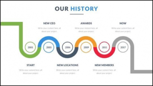
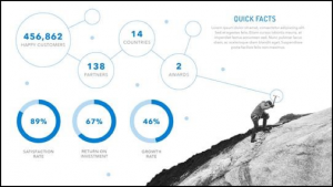
NOTE: Good presenters allow time for their audience to read these slides, and the more content on the slide, the longer they stay silent while the audience reads.
4. Focus on the audiences and what they want to know
No audience in the world wants to be sold to. They want to be informed, educated, entertained perhaps… but not sold to.
When a presentation focusses on the presenter’s company – company history, number of locations, key personnel, etc – it is BORING for the audience. If the audience wanted this information, they could look at a website or read a brochure. What is it that they want to know, instead of that basic boring info?
If it is a client presentation, the client wants to know what the presenter is going to do for them. Therefore a more interesting and engaging presentation will focus on the client – their vision and objectives, requirements and scope, expectations, unique circumstances, risks and challenges, opportunities and innovations, delivery strategy, risk mitigation plans… If a presentation covers this kind of information, the audience will be much more interested, attentive and engaged.
5. Explore the power of infographics and icons
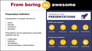
The days when slides were filled with lists, dot points and bullets are all but over. The more impactful way to format content is with infographics, icons and diagrams.
Consider the comparison below which shows boring lists of dot points on the left and the same content formatted with icons on the right.
6. Evoke emotion
the most compelling and persuasive presentations create an emotional connection with the audience. Powerful emotions to trigger in presentations include:
- aspiration – exciting the audience with a vision, showing how they can reach a new standard, showing their potential, visualising possibilities…
- pain – triggering within the audience their fear of failure or their frustration with poor performance…
- confidence – building the audience’s confidence in the presenter such as certainty in the presenter’s capability…
- compassion – creating empathy or sympathy in the audience, such as to get them to act benevolently…
7. Tell a story
Humans are hardwired for storytelling. Since the dawn of time, it is how the most crucial information has been shared and the most
important traditions passed on.
What makes stories so powerful is how they are processed by the brain. Stories activate the deep part of the brain where memory and emotion
work together: the hippocampus and amygdala. Furthermore, according to the scientists who use words like hippocampus and amygdala, the brains of a storyteller and their audiences have been shown to sync together during the story, meaning that a presenter and their audience can literally get on the same wavelength. How exciting as a presenter that they can use stories to bring their audience to their way of thinking! Any wonder stories are so memorable and engaging.
So what kind of story will work? In a professional context, a good story might be as simple as reminding the audience of the status quo and then revealing the path to a better way. In this way, the presenter sets up a conflict that needs to be resolved – and we all know that resolving conflict is the essence of a good story. This tension helps persuade the audience to do the thing that will move them from the status quo to the preferred reality.
8. Engage the audience
The best presentations are interactive and multi-sensory.
Great presenters engage their audience throughout the presentation, and turn a one-way lecture into a two-way (or even better,
multi-lateral) conversation. It takes a lot of skill, and introduces an element of risk, but it can be extraordinarily powerful to encourage questions from the audience, pose questions to the audience, elicit comments and feedback, gather relevant data… This can be done through live engagement around the room, roving microphones or even apps. In business presentations, it might be as simple as having a blueprint that can be rolled out on the table and the audience encouraged to circle round, or audience members given pens or stickers to mark up a milestones program or draft designs.
And truly powerful presentations engage all of the senses – hearing, sight, smell, taste and touch. Elements such as videos, music, lighting, coffee (or champagne), catering, and anything that can be tactile such as models, samples and prototypes all make presentations much more interesting, engaging and memorable.
9. Include a call to action
Instead of including a ‘thank you’ or ‘contact us’ slide, good presenters finish on a call to action slide which clearly defines what the audience is meant to do next – what the next step in their journey is. Importantly, the call to action needs to be the seamless, logical culmination of a presentation that has been clear, from beginning to end, on its purpose.
10. Refresh to a contemporary design
The old school design of slides is on the way out. With glee, we can finally say ‘goodbye’ to a header and footer on every page, a logo in
the corner, and text styles that cascade through progressively indented bullet lists.
The new look is much cleaner, simpler and fresher. Each slide in the slide pack should feel like part of the same story, using consistent typography, colours, design elements and imagery. The new look also reflects a stronger emphasis on the audience, rather than the presenter, so the corporate ego takes a back seat so that logos and corporate branding elements are few and far between.
Further Reading
If you want to read a little more on presentation or see some more examples, the following links may be of interest:
- An excellent TED blog: “10 tips on how to make slides that communicate your idea, from TED’s in-house expert” https://blog.ted.com/10-tips-for-better-slide-decks/
- A neat and simple ‘ before and after’ style article for design: “11 design tips for beautiful presentations” https://visage.co/11-design-tips-beautiful-presentations/
- Another simple article with great examples: “Top Ten slide tips” http://www.garrreynolds.com/preso-tips/design/
- A great article from Harvard Business Review on how to structure a story for a presentation: “Structure your presentation like a story” https://hbr.org/2012/10/structure-your-presentation-li
Aurora Marketing specialises in helping companies win their tenders and position themselves for success.

Recent Comments