Whenever people ask me about the importance of document formatting, I am reminded of a tip that one of my lecturers gave way back in my first year of University. She was advising us to put some thought in to how we presented our assignments. She encouraged us to use clear heading structure, wide margins, at least 1.5 line spacing, and – a left-field suggestion – to print the assignments on yellow paper.
Her reasoning was quite simple: she would be marking dozens of assignments, probably late in to the night, and she would be tired. She confessed that it was easy to lose interest and get bored or, worse, frustrated. Clear heading structure made it easier to understand the flow of the document; margins and spacing made it easier to follow; and the yellow paper was easier to read than white paper because of the reduced glare.
So basically, if we wanted to maximise our marks, we should make it easier for the marker: make it easy for them to follow, to find the information they are looking for, and to stay engaged. It was a lesson I have never forgotten, and easily applies to tender evaluations.
In bid teams, we frequently hear people talking about formatting the documents in order to ‘pretty them up’. And while good formatting does make documents look better, good formatting is so much more than simple aesthetics. Good formatting enhances readability, which means the document will be easier to understand, easier to remember and, ultimately, easier to score. Good formatting is about maximising our chances at winning.
Scanner, skimmer, intensive, extensive
Not everyone reads in the same way. In fact, there are four types of readers:
- A scanner reads a document searching for specific information. They use quick eye movements, not necessarily in a linear fashion, with their eyes wandering until they find the information they are looking for. They know precisely what they are looking for – such as a name, date, symbol, formula or phrase – and know when they have found it. Very little information is processed into long-term memory or even for immediate understanding because the objective is simply finding the specific information.
- A skimmer reads a document to get an overview of the topic. They read headings, introductions, first paragraphs of each section and summary sections, and they look at pictures, diagrams, tables, and phrases in bold or pullouts. Once they have their overview, they read more deeply in certain sections, possibly until they have read the full document. They do not necessarily read from start to finish.
- Intensive reading means reading the whole document and looking ‘inside’ the content. This type of reader notes linguistic or semantic details, identifies key vocabulary, makes notes and draws their own diagrams. They read the document carefully and thoroughly, again and again.
- Extensive reading goes beyond the single document and reads extensively for enhanced understanding. This type of reader enjoys the learning and discovery of the topic and goes beyond with their own additional reading and research. They read the content in depth, stop to clarify what they don’t understand, do further research to clarify items, discuss with others what they have read, and do their own thorough note taking and summarising of content. This style of reading is very effective, but very time consuming.
Not everyone on an evaluation panel will read the same way, and we can’t assume that they will all read intensively and/or extensively. But, what we can assume is that they will be reading several submissions, most likely a significant volume of materials, and the content will be somewhat repetitive given the tenderers will all be answering the same questions. The easier we can make their job by making the content easy to read, easy to comprehend, easy to recall and easy to assess, the better for us!
See for yourself
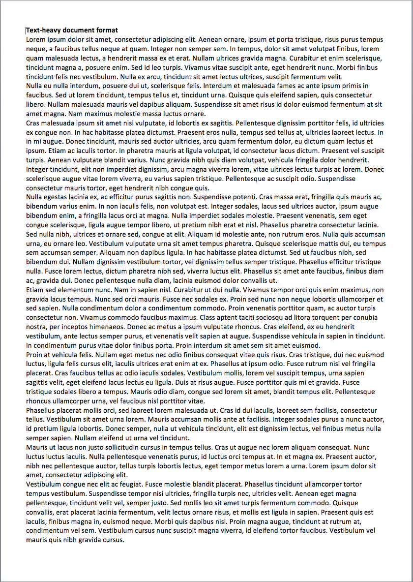
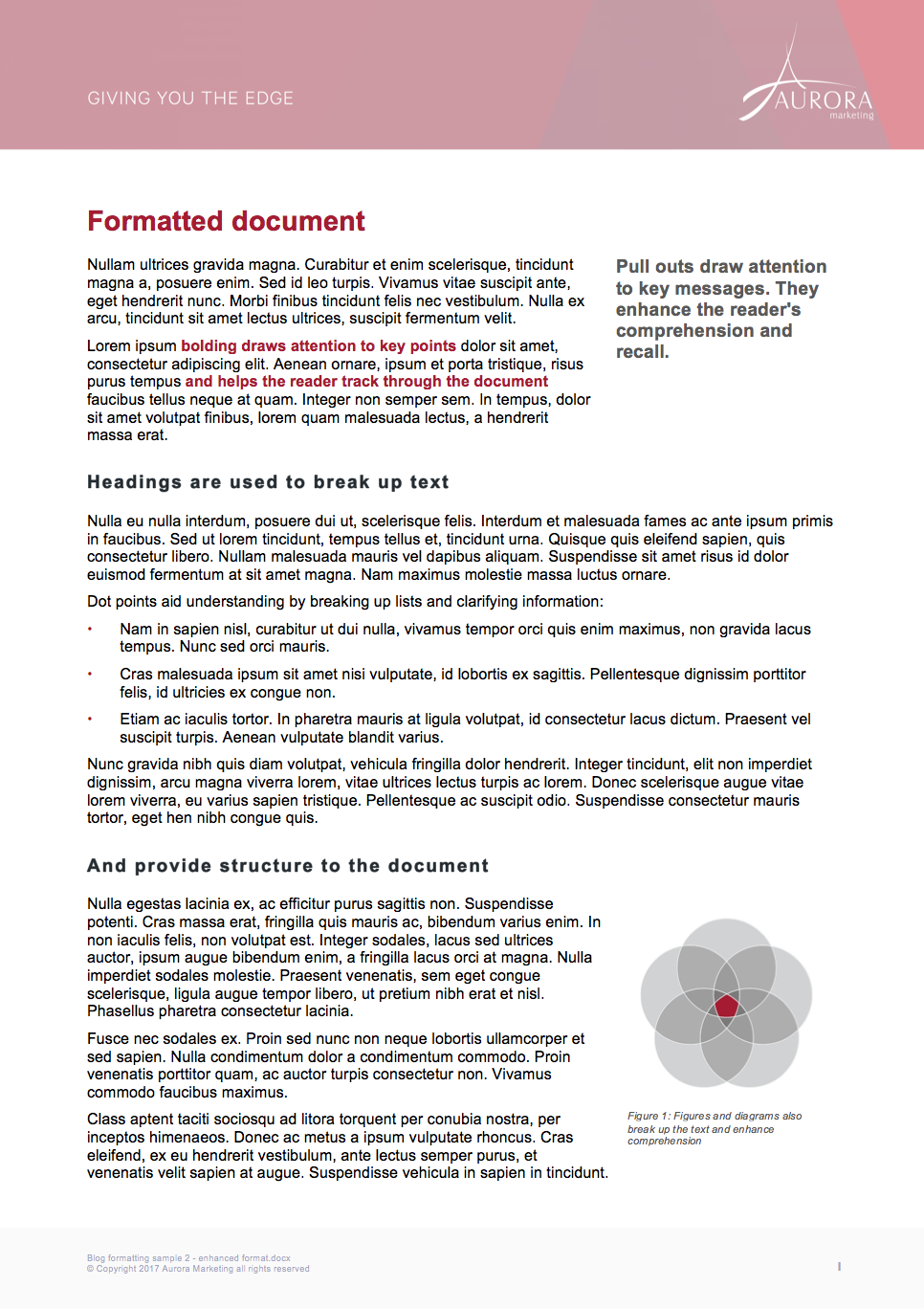
Notwithstanding that the text in the examples in Figure 1 is in Latin, which document layout looks like it would be easier to read, comprehend, recall and score?
Obviously, all of our clients and all of the evaluators we submit tenders to are all intelligent people, so they are capable of reading, comprehending, recalling and scoring the text from both, but which one would be easier? And which one would be easier when they are tired, or bored, or frustrated?
I hope you will agree that the document to the right will definitely be easier for the scanner and the skimmer, and almost certainly also easier for the intensive and extensive reader.


Figure 1: Compare a text-heavy document (first image) to another document that has been formatted with headings, dot points, pull outs, emphasis text and diagrams (second image). The document with enhanced formatting is easier to read, making it easier to comprehensive, recall and assess.
Formatting to improve readability
Importantly, not all documents should be formatted the same. And sometimes not even all documents to the same client should be formatted the same.
The style of formatting of the documents should match the style of the client. If a client is delivering a landmark, iconic project and is using a visionary tone and style, then our formatting should be similarly visionary and exciting. Whereas if a client is very dry and technical, looking for a straight-forward functional solution, then our formatting should be focussed on communicating technical and functional excellence. Essentially, we need to match the document style to the specific client because what appeals to one client will repel another.
And taking this concept one step further, different documents in each tender may call for different formatting. Some documents may be visionary and exciting, such as the executive summary, whereas other documents may be technical and functional, such as management plans. The style of formatting should match the style of the content.
We typically have a suite of templates ranging from dramatic documents with all the bells and whistles, to basic documents with a subdued design. As a baseline, these documents typically include:
- A clear heading structure with a clear hierarchy of content
- An easy-to-read font, in 10 or 11 point for body text and maybe a little smaller in tables
- Good line spacing, ideally about 1.2 line spacing and extra spacing above and below paragraphs
- Spacious margins, ideally 2 cms left, right and bottom, and 4 cms at top depending on header
- Appropriate use of dot points and numbered lists
- Appropriate use of tables, graphics and photos
- In-text bolding to emphasise key words and phrases
- Pull out quotes to reiterate key messages.
When following this approach, the end result is an entire tender that is easy to read, easy to comprehend, easy to recall, and easy to assess. And our results speak for themselves!
We can help you improve the readability of your documents by providing expert document formatting assistance on specific documents, or by developing a suite of document templates.

Recent Comments